The following scrapbooking layouts are some examples where I was inspired by something – colors, an object, an idea. Our trip to Italy and France brought us to so many different cities and sights, and as I put together my scrapbook, I wanted to incorporate as much of their unique qualities as possible. Enjoy!
On colors: In the first two scrapbooking layouts (Burano and Vernazza), the brightly-colored paper choices were influenced by the colorful buildings seen throughout the towns.
The only “side trip” we took from Venice was to the nearby island of Burano, known for colorful buildings and delicate lacework. The other option we considered was Murano (known for the glass blowing), but we opted to go to the less popular, slightly further island of Burano. We spent our time wandering through the empty streets, admiring the colorful houses, and shopping in the many lace and souvenir shops. I wanted to capture the fun, colorful aspect of the town in my scrapbooking page for Burano.

Taken on our visit to Burano, Italy. A nice break from the crowded island of Venice!

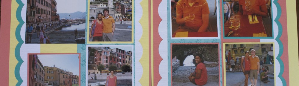
Vernazza was our home base for the three nights we stayed in Cinque Terre (the other four fishing villages in Cinque Terre are Riomaggiore, Manarola, Corniglia, and Monterosso al Mare – we spent at least a little bit of time in each). All five fishing villages are known for their colorful buildings. I wanted to construct the Vernazza scrapbooking page by capturing the dominating salmon and yellow colors of the buildings and the beautiful aqua of the Mediterranean.

A picture taken on our hike from Vernazza to Monterosso al Mare.

On creations: In Nice, we stayed at the Mercure hotel, which was separated from the Mediterranean only by the Promenade des Anglais. This wide promenade was perfect for strolling throughout the day and one of our favorite routes to travel to different parts of the city. I decided to recreate the look of the promenade by using gray paper for the aspahlt and white ribbon for the line separating the two sides. While it isn’t a super accurate depiction, it’s a fun way to decorate this scrapbooking page!


A closeup of the paper-and-ribbon Promenade des Anglais.
Finally, one of the last pages I completed for the Europe 2009 scrapbook was the Montmartre page, in Paris, France. I wasn’t feeling terribly inspired, however I loved the Montmartre area and wanted to include the pictures and memories from that time on our trip. I had a thought of using a chevron design for the background, but couldn’t find anything that fit what I was looking for. So, I decided to make my own background. I love this because it’s something anyone can do – I used a ruler, a pencil, and scissors. No special scrapbooking tools. Best of all, I was able to choose the colors and exactly how I wanted the design laid out on the page.

I don’t always have a great idea or use the colors of the photos to influence my pages, but when I do, I generally love the results! My favorite of the above layouts is probably the Vernazza page – the layout is clean and those colors look fabulous together.